In 2024, Jason (Designer), Maya (Engineer), and I audited every component in our design system and published it to the Figma Community.
The problem
Everything existed in both Figma and Storybook, but they'd quietly drifted apart. Names were different, things looked slightly off on each side, and it had gotten to a point where developers weren't sure what to follow. We also wanted to make the system public to attract talent, get more people engaging with what we were building, and eventually open source Gumroad entirely.
Approach
We audited buttons, pills, alerts, modals, and every other component across Figma and Storybook. We identified visual differences, implementation gaps, and naming that only made sense to designers or developers, then chose terminology that worked for both.
We rebuilt the components using Figma's newer properties and variables and documented them clearly so both sides could stay in sync. We also opened PRs to close the visual gaps in Storybook, so what designers handed off matched what developers built.
My contribution
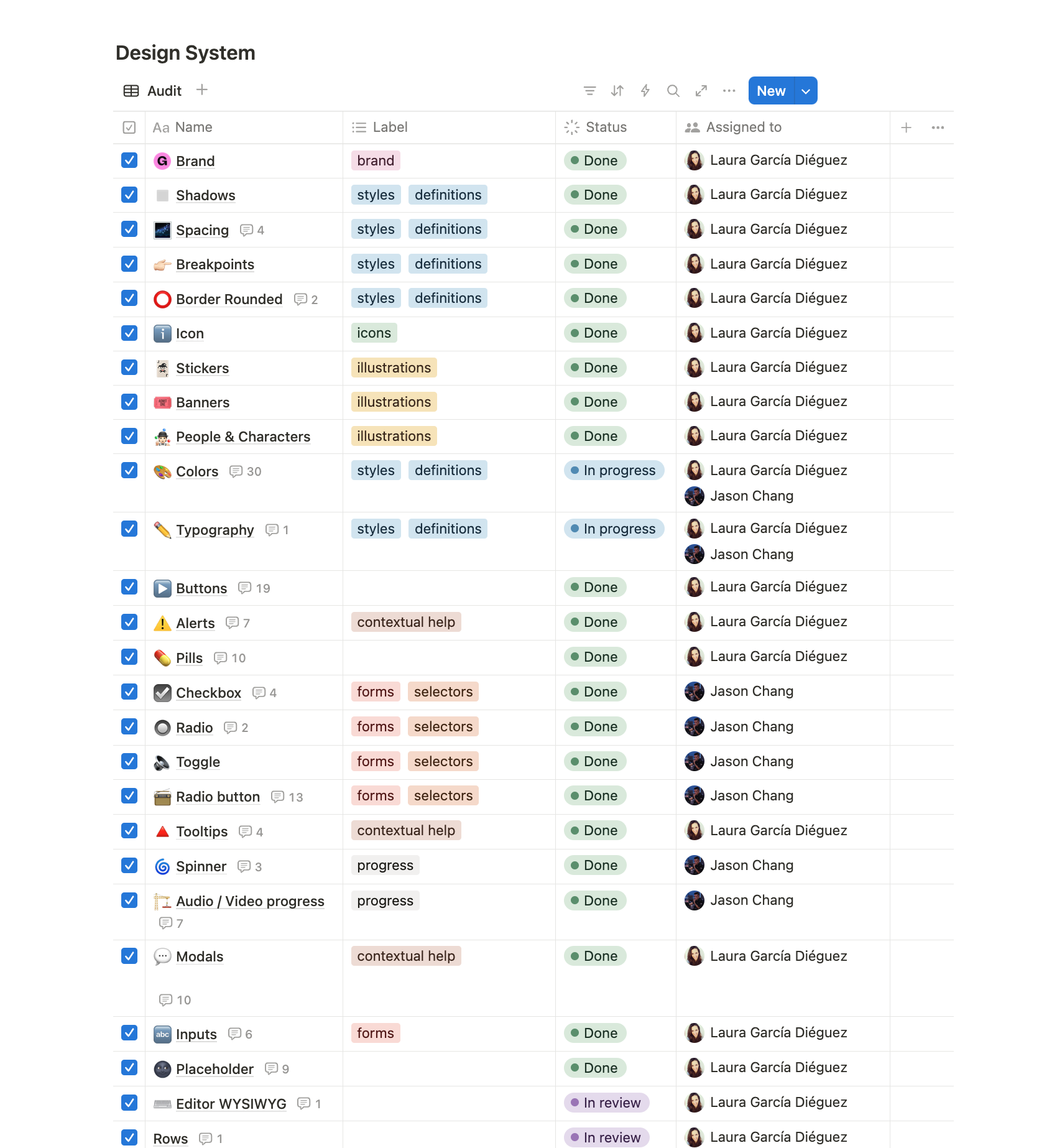
We divided the audit by assigning components to each person. My scope included foundations such as brand, shadows, spacing, breakpoints, and border radius; icon and illustration systems; and components including buttons, alerts, pills, tooltips, modals, inputs, and the WYSIWYG editor. I shared colors and typography with Jason.
Across those areas, I audited Figma against Storybook, rebuilt components using properties and variables, clarified naming and documentation, and contributed PRs to close visual gaps in the implementation.
Design system canvas in Notion
Outcome
We published the system to the Figma Community in August 2024. I also contributed implementation PRs that matched Figma and Storybook naming for pills, corrected the balance of the pill icon, and standardised alert typography.